
Create your own Material-UI Box component to style your projects
The Material UI Box component is a very useful component giving its user the power to mutate and create any HTML element he likes. From div to list or link, Box's capabilities don't stop there. Using the right props we can change its css properties dynamically with a variety of options to cover most of our needs.
When i first started as a frontend the most dominant UI frameworks were Bootstrap and Semantic Ui. Then Material started making its way through providing a more customizable option from its competitors. When I introduced myself into the ways of Material UI I didn't know the existence of the Box. As a junior dev I was using the basics such as Dropdowns, Buttons, Radio groups etc. After some months of using every library the wrong way, I crossed paths with Eddy, a Senior Frontend Engineer. And this is how i met Box. It was the most practical solution giving me both the scalability and flexibility i needed. Keeping everything clean and working perfectly with any kind of project.
Styled Components
After some time in the industry a pattern appeared in which people were starting to get rid of a fully ready-to-use UI framework. The reason was to create reusable custom tools with styled components, without all the extra stuff based on the project needs. To be honest, not every case can be done by hand. It depends on the team capacity and the difficulty of the feature/component/module we want to create. It's easier to create a Button which consists of a text and a basic functionality and it's harder to create a dropdown with multiple selection, disabled options, search functionality etc.
The Box component
According to Materials' documentation "The Box component serves as a wrapper component for most of the CSS utility needs.". You can think of Box as a div element. Even if we inspect the Box with our dev tools we can notice that by default it's a div element with a random generated className having the Box as a starting word.
<div
  display="flex"
  width="100%"
  class="Box-sc-na08bg-0 jWZrNE">
  Test Box
</div>
The above example creates on our DOM a div element with css properties of:
display: flex;
width: 100%;
The usage of the Box is quite simple. The user has to pass the appropriate prop to use the equivalent css property. The example above in our editor would look like this:
<Box display="flex" width="100%">
  Test Box
</Box>
In the same way we can change different styles such as:
Some more usage examples:
- Blue border.
<Box border={1} borderColor="blue">
  Test Box
</Box>
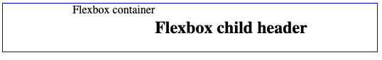
- Flexbox with blue border and child element.
<Box
  display="flex"
  justifyContent="center"
  border={1}
  borderColor="blue"
>
  Flexbox container
  <Box component="h2" alignSelf="center">
    Flexbox child header
  </Box>
</Box>
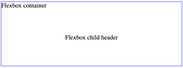
- Flexbox with column direction and typography properties example.
<Box
  display="flex"
  flexDirection="column"
  justifyContent="center"
  border={1}
  borderColor="blue"
  fontSize={20}
>
  Flexbox container
  <Box alignSelf="center" p={10}>
    Flexbox child header
  </Box>
</Box>
Most of the Box props have the same naming of the css property they represent. For instance, p is one of the many spacing props that we can use with the Box component. It's translated as the padding property. More props like this are:
- m = margin
- mt = margin-top
- mr = margin-right
- mb = margin-bottom
- ml = margin-left
- mx = margin-left, margin-right
- my = margin-top, margin-bottom
- p = padding
- pt = padding-top
- pr = padding-right
- pb = padding-bottom
- pl = padding-left
- px = padding-left, padding-right
- py = padding-top, padding-bottom
Our Box component
If you ever worked with different UI frameworks you would have noticed that most of the time we are using a small part of their contents. A common mistake for many junior developers was to underuse big libraries. It's like having a backpack filled with 10 tools while you need to use only one. The rest of them are dead weight to your back. I was no exception, until I finally understood the meaning of the less the better and started constructing my components on the go using only the Styled components library. Buttons, links, lists you name it and of course the Box.
The structure and the usage will follow the same rules of Material's UI Box. The main difference will be the course of the development. In our case we will work our custom Box exponentially. It means that we will start with some basic parts and then we will add new pieces as we move forward. For example, for the display property the use of flex and block values will be more than enough as it's more rare to use the rest options in a greenfield project(depending on the case).
The point of our Box is to be practical and simple, using only the absolute necessary for our project.
How to create the Box
For our implementation we will use React.js and Typescript. Our component will live in the components folder of our project.
First we start by creating the main Box.tsx file together with index.ts and types.ts. Index file will just export our Box. Types file will have all of our css properties types gathered and exported and then our Box file will be a simple styled component boosted with all of our css properties.
components/
  Box/
   Box.tsx
   index.ts
   types.ts
pages/
  AboutPage/
Starting with the index file. A simple file for exporting our main component and its types:
export { Box } from './Box';

export * from './types';
Then we have the Box.tsx. Inside this file sits a simple styled component element in which we import all of our style functions.
import styled from 'styled-components';
import { Flex } from './Flex';
import { Typography } from './Typography';
import { Borders } from './Borders';
import { Colors } from './Colors';
import { Spaces } from './Spaces';
import { Display } from './Display';
import { Position } from './Position';
import { Sizes } from './Sizes';

export const Box: any = styled.div`
    ${Flex}
    ${Typography}
    ${Borders}
    ${Colors}
    ${Spaces}
    ${Display}
    ${Position}
    ${Sizes}
`;
And finally the types.ts. Every style function has its own types. We simply gathered those types into one file.
import { FlexProps } from './Flex/types';
import {
  TypographyProps
  } from './Typography/types';
import { BordersProps } from './Borders/types';
import { ColorsProps } from './Colors/types';
import { SpacesProps } from './Spaces/types';
import { DisplayProps } from './Display/types';
import {
  PositionProps
  } from './Position/types';
import { SizesProps } from './Sizes/types';

export type BoxProps = FlexProps &
  TypographyProps &
  BordersProps &
  ColorsProps &
  SpacesProps &
  DisplayProps &
  PositionProps &
  SizesProps;
If the above seems a bit confusing stay with me a bit longer. If we look closer we can detect a major similarity between Box and Types files. Both of them are importing from the same sources. Each source represent a css style function. For instance, in the Borders directory we will include anything border-oriented. Adding all the above directories our project structure will change to:
components/
├─ Box/
│  ├─ Borders/
│  ├─ Colors/
│  ├─ Display/
│  ├─ Flex/
│  ├─ Position/
│  ├─ Sizes/
│  ├─ Spaces/
│  ├─ Typography/
│  ├─ Box.tsx
│  ├─ index.ts
│  ├─ types.ts
pages/
├─ AboutPage/
Each directory will have at least the index.ts, [css_function_name].tsx and types.ts. Starting from top to bottom our directory will be:
components/
├─ Box/
│  ├─ Borders/
│  │  ├─ index.ts
│  │  ├─ Borders.tsx
│  │  ├─ types.ts
Inside the Border.tsx we can see the css properties followed by an arrow function. In case we don't have the appropriate prop then the property remains undefined. (in some cases we can have a default value:
border-top: ${(props: BordersProps) =>
    props.borderTop ?
        `${props.borderTop}px solid`
        : '1px solid' }
Note: Not every property is necessary for your project. Even the Border directory could be useless at first. Start with that you need.
import { css } from 'styled-components';
import { BordersProps } from './types';

export const Borders = css`
  border: ${(props: BordersProps) =>
    props.border
      ? `${props.border}`
      : undefined};
  border-top: ${(props: BordersProps) =>
    props.borderTop
      ?`${props.borderTop}px solid`
      : undefined};
  border-bottom: ${(props: BordersProps) =>
    props.borderBottom
      ? `${props.borderBottom}px solid`
      : undefined};
  border-left: ${(props: BordersProps) =>
    props.borderLeft
      ? `${props.borderLeft}px solid`
      : undefined};
  border-right: ${(props: BordersProps) =>
    props.borderRight
      ? `${props.borderRight}px solid`
      : undefined};
  border-radius: ${(props: BordersProps) =>
    props.borderRadius || undefined};
  border-radius: ${(props: BordersProps) =>
    props.rounded ? '50%' : undefined};
  border-color: ${(props: BordersProps) =>
    props.borderColor || undefined};
`;
Inside the types.ts we keep all the types pointing to our Borders.tsx file. Every value is optional following the original Box pattern.
import { Property } from 'csstype';

export interface BordersProps {
  border?: Property.Border;
  borderTop?: Property.BorderTop;
  borderBottom?: Property.BorderBottom;
  borderLeft?: Property.BorderLeft;
  borderRight?: Property.BorderRight;
  borderRadius?: Property.BorderRadius;
  rounded?: boolean;
  borderColor?: Property.BorderColor;
}
Following the above pattern we will create the same way the Colors, Flex, Position, Sizes and Spaces as seen below:
Colors
Colors.tsx
import { css } from 'styled-components';
import { ColorsProps } from './types';

export const Colors = css`
  color: ${(props: ColorsProps) =>
    props.color || undefined};
  background-color: ${(props: ColorsProps) =>
    props.backgroundColor || undefined};
`;
types.ts
export interface ColorsProps {
  color?:
    'primary'
    | 'secondary'
    | 'success'
    | 'danger'
    | 'lightText'
    | string;
  backgroundColor?:
    'primary'
    | 'secondary'
    | 'danger'
    | string;
}
index.ts
export { Colors } from './Colors';
Flex
Flex.tsx
import { css } from 'styled-components';
import { FlexProps } from './types';

export const Flex = css`
  flex-direction: ${(props: FlexProps) =>
    props.flexDirection || undefined};
  flex-wrap: ${(props: FlexProps) =>
    props.wrap || undefined};
  align-items: ${(props: FlexProps) =>
    props.alignItems || undefined};
  justify-content: ${(props: FlexProps) =>
    props.justifyContent || undefined};
  flex: ${(props: FlexProps) =>
    props.flex || undefined};
  align-self: ${(props: FlexProps) =>
    props.alignSelf || undefined};
`;
types.ts
import { Property } from 'csstype';

export interface FlexProps {
  flexDirection?: Property.FlexDirection;
  justifyContent?: Property.JustifyContent;
  alignItems?: Property.AlignItems;
  wrap?: Property.FlexWrap;
  flex?: Property.Flex;
  alignSelf?: Property.AlignSelf;
}
index.ts
import { Flex } from './Flex';

export { Flex };
Position
Position.tsx
import { css } from 'styled-components';
import { PositionProps } from './types';

export const Position = css`
  position: ${(props: PositionProps) =>
    props.position || undefined};
  top: ${(props: PositionProps) =>
    props.top || undefined};
  bottom: ${(props: PositionProps) =>
    props.bottom || undefined};
  left: ${(props: PositionProps) =>
    props.left || undefined};
  right: ${(props: PositionProps) =>
    props.right || undefined};
`;
types.ts
import { Property } from 'csstype';

export interface PositionProps {
  position?: Property.Position;
  top?: Property.Top;
  bottom?: Property.Bottom;
  left?: Property.Left;
  right?: Property.Right;
}
index.ts
export { Position } from './Position';
Sizes
Sizes.tsx
import { css } from 'styled-components';
import { SizesProps } from './types';

export const Sizes = css`
  width: ${(props: SizesProps) =>
    props.width || undefined};
  height: ${(props: SizesProps) =>
    props.height || undefined};
  max-width: ${(props: SizesProps) =>
    props.maxWidth || undefined};
  max-height: ${(props: SizesProps) =>
    props.maxHeight || undefined};
  min-width: ${(props: SizesProps) =>
    props.minWidth || undefined};
  min-height: ${(props: SizesProps) =>
    props.minHeight || undefined};
`;
types.ts
import { Property } from 'csstype';

export interface SizesProps {
  width?: Property.Width;
  height?: Property.Height;
  maxWidth?: Property.MaxWidth;
  maxHeight?: Property.MaxHeight;
  minWidth?: Property.MinWidth;
  minHeight?: Property.MinHeight;
}
index.ts
export { Sizes } from './Sizes';
Spaces
Spaces.tsx
import { css } from 'styled-components';
import { SpacesProps } from './types';

export const Spaces = css`
  margin-top: ${(props: SpacesProps) =>
    props.mt ? `${props.mt}px` : undefined};
  margin-bottom: ${(props: SpacesProps) =>
    props.mb ? `${props.mb}px` : undefined};
  margin-left: ${(props: SpacesProps) =>
    props.ml ? `${props.ml}px` : undefined};
  margin-right: ${(props: SpacesProps) =>
    props.mr ? `${props.mr}px` : undefined};
  margin: ${(props: SpacesProps) =>
    props.m || undefined};

  padding-top: ${(props: SpacesProps) =>
    props.pt ? `${props.pt}px` : undefined};
  padding-bottom: ${(props: SpacesProps) =>
    props.pb ? `${props.pb}px` : undefined};
  padding-left: ${(props: SpacesProps) =>
    props.pl ? `${props.pl}px` : undefined};
  padding-right: ${(props: SpacesProps) =>
    props.pr ? `${props.pr}px` : undefined};
  padding: ${(props: SpacesProps) =>
    props.p || undefined};
`;
types.ts
import { Property } from 'csstype';

export interface SpacesProps {
  m?: Property.Margin;
  mt?: Property.MarginTop;
  mb?: Property.MarginBottom;
  ml?: Property.MarginLeft;
  mr?: Property.MarginRight;
  p?: Property.Padding;
  pt?: Property.PaddingTop;
  pb?: Property.PaddingBottom;
  pl?: Property.PaddingLeft;
  pr?: Property.PaddingRight;
}
index.ts
export { Spaces } from './Spaces';
The updated directory will be:
components/
├─ Box/
│  ├─ Borders/
│  │  ├─ index.ts
│  │  ├─ Borders.tsx
│  │  ├─ types.ts
│  ├─ Colors/
│  │  ├─ index.ts
│  │  ├─ Colors.tsx
│  │  ├─ types.ts
│  ├─ Display/
│  ├─ Flex/
│  │  ├─ index.ts
│  │  ├─ Flex.tsx
│  │  ├─ types.ts
│  ├─ Position/
│  │  ├─ index.ts
│  │  ├─ Position.tsx
│  │  ├─ types.ts
│  ├─ Sizes/
│  │  ├─ index.ts
│  │  ├─ Sizes.tsx
│  │  ├─ types.ts
│  ├─ Spaces/
│  │  ├─ index.ts
│  │  ├─ Spaces.tsx
│  │  ├─ types.ts
│  ├─ Typography/
│  ├─ Box.tsx
│  ├─ index.ts
│  ├─ types.ts
pages/
├─ AboutPage/
As we mentioned in the begging, our purpose is not to create a feature-full Box component. Start with your personal needs and scale from there.
Explaining the Display and Typography directories
For the Display and Typography properties we have to dive to more details in order to be more understandable. The Display you can either create it as the previous or go a step further and add media queries in order to have responsive screens for your app.
components/
├─ Box/
│  ├─ Display/
│  │  ├─ index.ts
│  │  ├─ Display.tsx
│  │  ├─ types.ts
│  │  ├─ utils.ts
pages/
├─ AboutPage/
Index.ts file remains the same as the previous examples with the types.ts looking like this:
import { Property } from 'csstype';

export type DisplayType =
  DisplayValuesType
  | StringTMap<HiddenDisplayType>;
type HiddenValuesType =
  'xs'
  | 'sm'
  | 'md'
  | 'lg'
  | 'xl';
type DisplayValuesType = Property.Display;

export type HiddenDisplayType = {
  [key in keyof HiddenValuesType]:
  DisplayValuesType;
};

/**
 * e.g. display={{ xs: "none", sm: "flex" }}
 */
export interface DisplayProps {
  display?: DisplayType;
}

export interface StringTMap<T> {
  [key: string]: T;
}
Creating one type that merges both css default display values and our hidden values for our media view.
Watching closely the Display file we can spot two functions. Our main function convertDisplayValue in which we check if the parameter is string. In case it's a string we pass the string as a value to our display property. Else, we move to our next function hiddenObjectToCss in which we map the keys we pass as our parameter and convert them to a media query view through convertMediaValueToTheme.
import { css } from 'styled-components';
import { DisplayType, DisplayProps } from './types';
import { convertMediaValueToTheme } from './utils';

function hiddenObjectToCss(propValues: DisplayType) {
  let mediaCSS = '';

  Object.entries(propValues).map(
    ([name, value]) =>
      (mediaCSS += `
    @media ${convertMediaValueToTheme(name)} {
        display: ${value}
    }
`)
  );

  return mediaCSS !== '' ? mediaCSS : undefined;
}

function isString(value: any) {
  return typeof value ===
    'string' || value instanceof String;
}

function convertDisplayValue
  (propValue: DisplayType)
  {
  return isString(propValue)
    ? `display: ${propValue}`
    : hiddenObjectToCss(propValue);
}

export const Display = css`
  ${(props: DisplayProps) =>
    props.display
      ? convertDisplayValue(props.display)
      : undefined};
`;
convertMediaValueToTheme is a simple switch statement which returns, based on the key, the correct media. it's imported from the utils file which resides inside our Display directory. The media values are based on your project needs. An sm media sits at 576px for my project purposes but for you it can be something different. You are free to choose what suits you!
export const convertMediaValueToTheme = (
  propValue: string
): string | undefined => {
  switch (propValue) {
    case 'xs': {
      return '(min-width: 0px)';
    }
    case 'sm': {
      return `(min-width: 576px)`;
    }
    case 'md': {
      return `(min-width: 768px)`;
    }
    case 'lg': {
      return `(min-width: 992px)`;
    }
    case 'xl': {
      return `(min-width: 1200px)`;
    }
    default:
      return undefined;
  }
};
Display prop usage:
<Box
  display={{ sm: 'flex', md: 'none' }}
>
  In min-width: 768px the display will be none.
</Box>
<Box
  display="flex"
>
  Element with display flex.
</Box>
Finally, the Typography property it's less complex than Display. Here i prefer to keep both font styles and the rest of the css properties e.g. overflow, z-index, opacity etc. If this case doesn't work for you then you can create one or more directories to keep the rest of the Box properties there. (you can create as many directories until you feel comfortable with your Box structure).
import { css } from 'styled-components';
import { TypographyProps } from './types';
import { convertFontSize } from './utils';

export const Typography = css`
  font-size: ${(props: TypographyProps) =>
    props.fontSize
      ? `${convertFontSize(props.fontSize)}`
      : undefined};
  font-style: ${(props: TypographyProps) =>
    props.fontStyle || undefined};
  font-weight: ${(props: TypographyProps) =>
    props.fontWeight || undefined};
  font-family: ${(props: TypographyProps) =>
    props.fontFamily || undefined};
  text-align: ${(props: TypographyProps) =>
    props.textAlign || undefined};
  vertical-align: ${(props: TypographyProps) =>
    props.verticalAlign || undefined};
  white-space: ${(props: TypographyProps) =>
    props.nowrap ? 'nowrap' : undefined};

  overflow: ${(props: TypographyProps) =>
    props.overflow || undefined};
  overflow-x: ${(props: TypographyProps) =>
    props.overflowX || undefined};
  overflow-y: ${(props: TypographyProps) =>
    props.overflowY || undefined};
  z-index: ${(props: TypographyProps) =>
    props.zIndex || undefined};
  word-break: ${(props: TypographyProps) =>
    props.wordBreak || undefined};
  cursor: ${(props: TypographyProps) =>
    props.cursor || undefined};
  opacity: ${(props: TypographyProps) =>
    props.opacity || undefined};
  transform: ${(props: TypographyProps) =>
    props.transform || undefined};
`;
With its types:
import { Property } from 'csstype';

export interface TypographyProps {
  nowrap?: boolean;
  truncated?: boolean;
  zIndex?: number;
  variant?:
    | 'h1'
    | 'h2'
    | 'h3'
    | 'h4'
    | 'h5'
    | 'h6'
    | 'text1'
    | 'text2'
    | 'link';
  fontSize?: Property.FontSize;
  fontWeight?: Property.FontWeight;
  fontStyle?: Property.FontStyle;
  fontFamily?: Property.FontFamily;
  wordBreak?: Property.WordBreak;
  textAlign?: Property.TextAlign;
  verticalAlign?: Property.VerticalAlign;
  overflow?: Property.Overflow;
  overflowX?: Property.OverflowX;
  overflowY?: Property.OverflowY;
  cursor?: Property.Cursor;
  opacity?: Property.Opacity;
  transform?: Property.Transform;
}
Optional: You can create you own variant of different elements to be passed as a prop in the Box.
An example would be:
import { css } from 'styled-components';
import { TypographyProps } from './types';
import { convertFontSize } from './utils';

const truncatedCSS = css`
  white-space: nowrap;
  overflow: hidden;
  text-overflow: ellipsis;
`;

const h1 = css`
  font-size: 19px;
  line-height: 1.4;
  font-weight: bold;
  margin: 0;
`;

const h2 = css`
  font-size: 18px;
  line-height: 1.4;
  margin: 0;
`;

const h3 = css`
  font-size: 16px;
  line-height: 1.4;
  font-weight: bold;
  margin: 0;
`;

const h4 = css`
  font-size: 14px;
  line-height: 1.3;
  font-weight: bold;
  text-transform: uppercase;
  margin: 0;
`;

const h5 = css`
  font-size: 12px;
  line-height: 1.3;
  letter-spacing: 0.02em;
  font-weight: bold;
  text-transform: uppercase;
  margin: 0;
`;

const h6 = css`
  font-size: 12px;
  line-height: 1.3;
  letter-spacing: 0.02em;
  text-transform: uppercase;
  margin: 0;
`;

const text1 = css`
  font-size: 14px;
  line-height: 1.4;
`;

const text2 = css`
  font-size: 13px;
  line-height: 1.4;
`;

const link = css`
  text-decoration: underline;
  cursor: pointer;
`;
export const Typography = css`
  ${(props: TypographyProps) =>
    props.variant === 'h1'
      ? h1
      : undefined};
  ${(props: TypographyProps) =>
    props.variant === 'h2'
      ? h2
      : undefined};
  ${(props: TypographyProps) =>
    props.variant === 'h3'
      ? h3
      : undefined};
  ${(props: TypographyProps) =>
    props.variant === 'h4'
      ? h4
      : undefined};
  ${(props: TypographyProps) =>
    props.variant === 'h5'
      ? h5
      : undefined};
  ${(props: TypographyProps) =>
    props.variant === 'h6'
      ? h6
      : undefined};
  ${(props: TypographyProps) =>
    props.variant === 'text1'
      ? text1
      : undefined};
  ${(props: TypographyProps) =>
    props.variant === 'text2'
      ? text2
      : undefined};
  ${(props: TypographyProps) =>
    props.variant === 'link'
      ? link
      : undefined};
  ${(props: TypographyProps) =>
    props.truncated ?
      truncatedCSS
      : undefined};
`;
A different approach in order to convert the Box from div element to something else without precreating all the above components is the use of as prop.
For example:
<Box
  fontWeight={400}
  fontSize="18px"
  color="#5f5c68"
  fontFamily="Source Sans Pro"
  as="h3"
>
  {user.email}
</Box>
Conclusion
Creating your own Box gives you a clean and scalable approach of Material's most-used component. Using it is a simple process for the developer. You can either add a variety of props (it depends on what you have added in your Box directory) or you can go hybrid and work your way using both class names and props. If you love reusing your components then Box is for you. It's up to your personal preference on how you are gonna use it. At the end of the day you will have a dependency-free tool without any unnecessary stuff. Reading the above post (without skipping to the conclusion) will grant you the ability to create awesome styles as you like without any restrictions in your future projects. Thanks for reading. See you around!